The Death of the Traditional Landing Page: Interactive Storytelling in Web Design
For the last decade, the B2B and SaaS landing page formula has been practically set in stone.
It goes like this: Hero section with a witty H1 and an oversized CTA. A row of logos indicating "trusted by." Three columns of features with generic vector icons. A testimonial slider. A pricing table. Another CTA. Footer.
It is predictable. It is safe. And increasingly, it is completely ineffective.
Users have developed severe banner blindness to this rigid structure. They scroll past the features, ignore the testimonials, and bounce within seconds. We are witnessing the death of the traditional landing page. In its place, a new paradigm is emerging, driven by a desire for engagement over mere information delivery: Interactive Storytelling.
The Shift from Informing to Experiencing
The traditional landing page treats the user as a passive receptacle for information. The goal is to shout features at them until they convert.
Interactive storytelling flips this dynamic. It treats the user as an active participant in a narrative. Instead of telling the user how a product works, it lets them feel how it works through exploration and discovery.
This approach is driven by three key techniques that are currently reshaping high-end web design.
1. Scrollytelling (Scroll-Triggered Animation)
Scrollytelling is the backbone of the modern, immersive landing page. Instead of the user scrolling down to reveal static blocks of text, their scroll action drives an animation or a narrative sequence forward.
Why it works: It hijacks the standard scrolling behavior and turns it into a mechanism of control. The user dictates the pace of the story. Apple has mastered this technique; their product pages rarely have static layouts. Instead, as you scroll, the product rotates, dissects itself, and highlights features contextually.
Implementation Strategy: Use libraries like GSAP (GreenSock Animation Platform) and ScrollTrigger to pin elements to the screen while other content flows past, creating a sense of depth and progression without requiring the user to navigate to multiple pages.
2. Interactive Data and Sandboxes
Telling a user "our tool is fast" is weak copy. Letting a user drag a slider and visually watch the tool process data in real-time is an undeniable proof of concept.
Why it works: It shifts the burden of proof from marketing copy to the product itself. For complex digital products, replacing a static screenshot with a mini "sandbox" environment on the landing page is incredibly powerful. Let them play with a simplified version of the UI before they even create an account.
Implementation Strategy: If you sell a design tool, let them adjust a gradient on the hero section. If you sell financial software, provide an interactive calculator that updates dynamically as they scrub through data points.
3. WebGL and 3D Integration
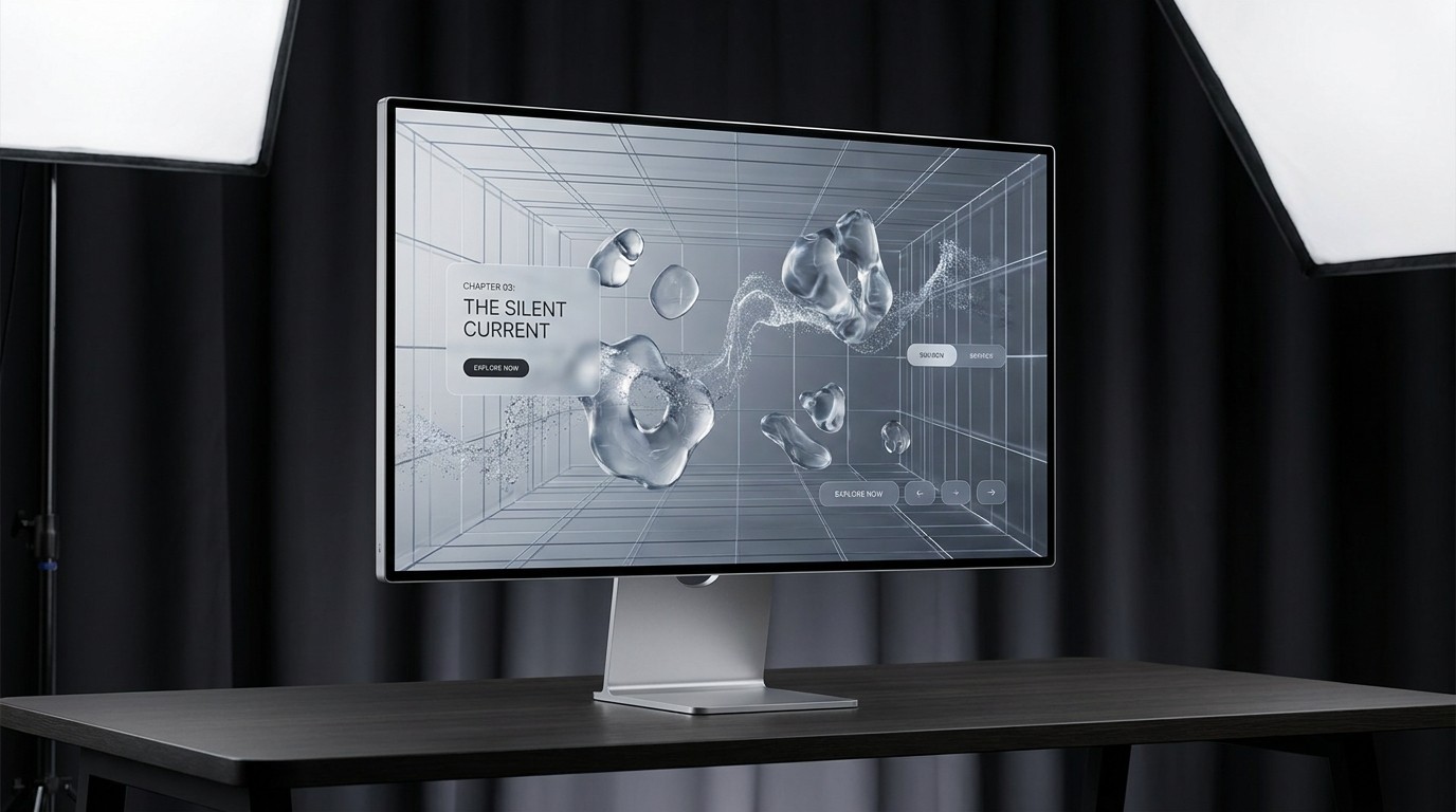
The integration of 3D elements in web design used to be a performance nightmare, reserved for heavy, experimental agency sites. Today, thanks to WebGL and libraries like Three.js (and React Three Fiber), performant 3D is accessible for everyday product pages.
Why it works: 3D elements add a tactile, premium feel that flat graphics simply cannot match. They break the flat plane of the screen, creating an immersive, memorable experience.
Implementation Strategy: You don't need a full 3D world. Even subtle integrations—like a 3D product model that subtly tracks the user's mouse movement, or a background particle system that reacts to scroll velocity—can significantly elevate the perceived value of the brand.
The ROI of Immersion
Skeptics often argue that interactive storytelling is too complex, too expensive to build, and distracts from the "conversion."
This is a narrow view of conversion. While a simple static page might optimize for immediate, low-intent clicks, interactive storytelling optimizes for brand recall and high-intent engagement. When a user spends three minutes exploring an interactive narrative about your product, they are vastly more qualified and invested than someone who skimmed a static bulleted list for 15 seconds.
The era of "paint-by-numbers" web design is ending. To capture attention in today's digital landscape, you must stop building brochures and start building experiences.