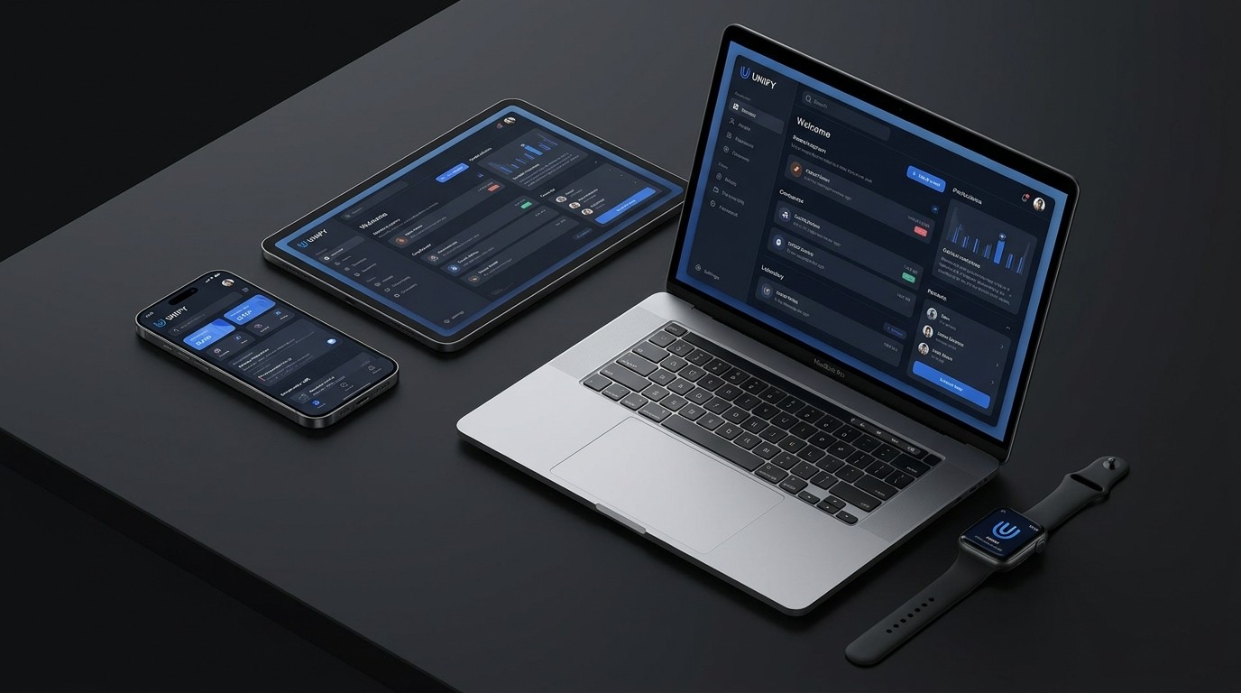
If you work in digital design, you’ve heard the mantra "Mobile-First" repeated ad nauseam since about 2012. It was a necessary overcorrection—a vital push to force designers to prioritize the constraints of a small screen before adding the luxury of a large desktop layout.
But in today’s hardware ecosystem, clinging strictly to a binary "mobile vs. desktop" mindset is holding your product back.
We no longer live in a two-screen world. Users seamlessly transition between a 6-inch smartphone, a 12-inch tablet, a 16-inch laptop, a 32-inch ultrawide monitor, and perhaps a 2-inch smartwatch—often while trying to accomplish the exact same task.
Mobile-first is obsolete. The new imperative is designing for the 'Omni-Screen' experience.
The Problem with Traditional Responsive Design
Traditional responsive web design (using basic media queries to stack columns on smaller screens) was a great band-aid, but it falls short in the omni-screen era.
If you design a beautiful mobile app and simply stretch it to fill an iPad screen, you end up with comically large typography, vast empty wastelands of white space, and a feeling that the app is fundamentally broken. Conversely, taking a dense desktop dashboard and merely stacking all the panels vertically for a phone results in an endless, frustrating scroll.
True omni-screen design requires adaptive thinking. It’s about creating an interface that feels natively designed for the specific device it currently inhabits, maximizing the unique advantages of that form factor.
Strategies for Omni-Screen Adaptation
Designing fluid, adaptive interfaces requires moving beyond fixed breakpoints and embracing structural flexibility.
1. Master the Concept of "Fluid Typography" and Space
Don't rely on fixed font sizes for specific devices (e.g., 16px on mobile, 20px on desktop). Instead, use CSS Clamp and viewport units to create typography that scales smoothly and proportionally as the screen size changes.
This same concept applies to spacing (margins and padding). Fluid spacing ensures your layout expands gracefully to fill a massive ultrawide monitor without looking awkwardly stretched.
2. Context-Aware Navigation
Navigation is the hardest part of omni-screen design. A hamburger menu is acceptable on a phone, but it is an anti-pattern on a large desktop monitor where you have ample space to display the full menu structure.
The Omni-Screen Approach:
Mobile: Bottom navigation bars (for core features) or a well-structured hamburger menu.
Tablet (Portrait): Often a hybrid—a persistent bottom bar or a collapsible side drawer.
Tablet (Landscape) / Desktop: A persistent, always-visible side rail or top navigation bar.
The UI should automatically adapt its navigation strategy based on available real estate, ensuring the user always has the most efficient path forward.
3. Component Re-architecture, Not Just Re-sizing
When moving from a small screen to a large screen, don't just make the components bigger. Rearrange them to provide more context.
Consider an email app.
On a phone: You see a list of emails. Tapping one opens a new screen with the email content.
On a tablet/desktop: The screen should split into a master-detail view. The list of emails stays on the left, while the selected email's content appears on the right.
This requires designing modular components that know how to arrange themselves based on context, rather than monolithic page designs.
Embrace the Ecosystem
The omni-screen philosophy requires a shift in how designers evaluate their work. Stop presenting static mockups of an "iPhone view" and a "MacBook view."
Start prototyping fluidly. Test your designs by constantly resizing the browser window, dragging the app between screens, and evaluating how it feels in the awkward 'in-between' sizes.
Your users do not care about breakpoints. They care about completing their tasks as frictionlessly as possible, regardless of the glass they are currently tapping, clicking, or swiping. Design an ecosystem that respects that fluidity.