The Psychology of Color in Digital Branding: Stop Guessing and Start Converting
The Psychology of Color in Digital Branding: Stop Guessing and Start Converting
If you are choosing your brand's digital color palette based on what "looks nice," you are leaving money on the table. In digital branding, color is not just an aesthetic choice; it is a subconscious conversion driver. Research shows that up to 90% of our snap judgments about products stem from color alone.
Color influences where the eye goes, how a user feels about your brand's trustworthiness, and ultimately, whether they click that "Buy Now" button. It is time to stop guessing and start treating your color palette like the conversion tool it is.
The High-Converting Colors
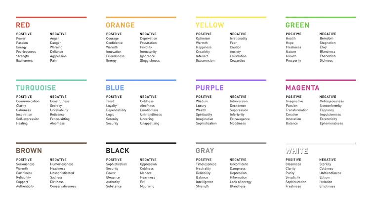
Different hues trigger distinct behavioral responses. Here is how the heavy hitters perform when it comes to driving digital actions:
Color | Emotional Trigger | Best For | Conversion Impact |
Red | Urgency, Excitement, Action | Time-sensitive sales, fast food | Increases perceived urgency; A/B tests have shown red CTAs outperforming green ones by up to 21%. |
Blue | Trust, Security, Calm | Finance, Healthcare, B2B tech | Builds reliability. Healthcare sites can see up to 18% higher trust ratings when using blues and greens. |
Orange | Friendliness, Immediacy | E-commerce "Add to Cart" | Combines the urgency of red with the warmth of yellow. Often out-converts green and blue buttons in e-commerce settings. |
Green | Growth, Wellness, Harmony | Eco-friendly products, finance | Highly reassuring. Often preferred over red or orange when the user needs to feel safe completing a transaction. |
3 Rules for Color-Driven Conversions
Contrast is King: It does not matter if your button is the "perfect" psychological shade if it blends into the background. The human eye processes contrast before any other visual detail. For maximum readability, ensure a contrast ratio of at least 4.5:1 for standard text, and up to 7:1 for smaller elements. Your Call-to-Action (CTA) should be the most visually distinct element on the screen.
Consistency Builds Retention: If your Instagram ads are bright purple but your landing page is muted gray, the visual disconnect causes friction. Companies that maintain a consistent color scheme across platforms see up to 23% higher customer retention.
Context Overrides "Rules": You will often read that "red means stop, green means go," implying green is always better for conversions. However, context dictates reality. If your entire brand identity is green, a green CTA will get lost. A red or orange button would provide the necessary visual break to draw the eye.