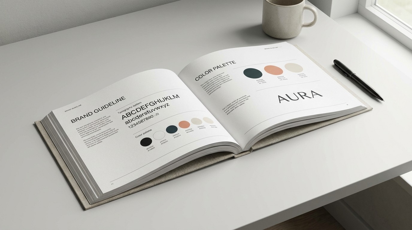
It’s the most common misconception in digital design: “We need a brand. Let’s get a logo.”
For over a decade, I’ve watched startups and established companies alike fall into this trap. A logo is an identifier, a signature at the bottom of a document. It is not, by any stretch of the imagination, a brand. If you rely solely on a logo to communicate who you are to your audience, you are fighting a losing battle in an increasingly noisy digital landscape.
What you actually need is a comprehensive visual ecosystem. This ecosystem is the holistic environment in which your brand lives and breathes. It dictates how your brand looks, feels, and sounds across every single touchpoint, from an Instagram ad to a SaaS dashboard, from an email newsletter to a massive outdoor billboard.
The Anatomy of a Visual Ecosystem
Building a visual ecosystem requires moving beyond a single graphic and developing a flexible toolkit of elements that work together harmoniously. When these elements are aligned, they create a memorable and consistent brand identity that builds trust and recognition faster than any standalone logo ever could.
Let's break down the core components of a robust visual ecosystem.
1. Typography: The Voice of Your Brand
Typography is arguably more important than your logo. It carries the literal message of your brand and dictates the tone in which it is received.
Consider the difference in perception between a sleek, geometric sans-serif (like Helvetica or Futura) and a classic, high-contrast serif (like Garamond or Playfair Display). One screams modernity and efficiency; the other whispers tradition and elegance.
Key Typography Considerations:
Hierarchy: Establish clear rules for H1s, H2s, body copy, and captions.
Pairing: Limit yourself to two, maybe three, typefaces that complement each other.
Legibility: Never sacrifice readability for style, especially in digital environments.
2. Color Palettes: Engineering Emotion
Color is not merely decorative; it is deeply psychological. A sophisticated visual ecosystem utilizes a strategic color palette that goes far beyond a single "brand color."
You need a system that can accommodate diverse needs: calls-to-action that need to pop, backgrounds that need to recede, and success/error states in digital products that need to be universally understood.
Color Type | Purpose | Example Hex |
|---|---|---|
Primary | The dominant brand color, used for key moments. |
|
Secondary | Supports the primary color, used for accents. |
|
Neutrals | Text, borders, backgrounds. Essential for balance. |
|
Semantic | System states (Success, Warning, Error). |
|
3. Imagery and Illustration Style
Whether you use photography, 3D renders, or flat illustrations, the style must be consistent. If you use dark, moody photography on your website but bright, cartoonish illustrations on your social media, you are causing cognitive dissonance in your audience.
Define rules for your imagery. Do your photos use a specific color grade? Are your illustrations geometric or organic? Documenting these rules ensures that even if different designers work on your brand, the output remains cohesive.
4. Graphic Elements and Layout Systems
These are the unsung heroes of visual identity. Patterns, icons, grid systems, and specific framing techniques create a recognizable rhythm. Think of the intricate patterns used by luxury brands or the strict, expansive grid systems used by editorial publications. These elements often do the heavy lifting when a logo is entirely absent.
The ROI of Consistency
Why invest the time and resources into building this ecosystem? Because consistency breeds trust.
When a user encounters a seamless brand experience—where the email newsletter looks like the website, which feels like the app, which echoes the social media feed—they subconsciously register the brand as professional, reliable, and established. This perceived reliability directly translates to higher conversion rates, stronger brand loyalty, and an increased willingness to pay a premium for your product or service.
Stop obsessing over the logo. Start architecting the ecosystem.