From Freebie to Flagship: Structuring the Visual Design of Your Digital Product Ladder
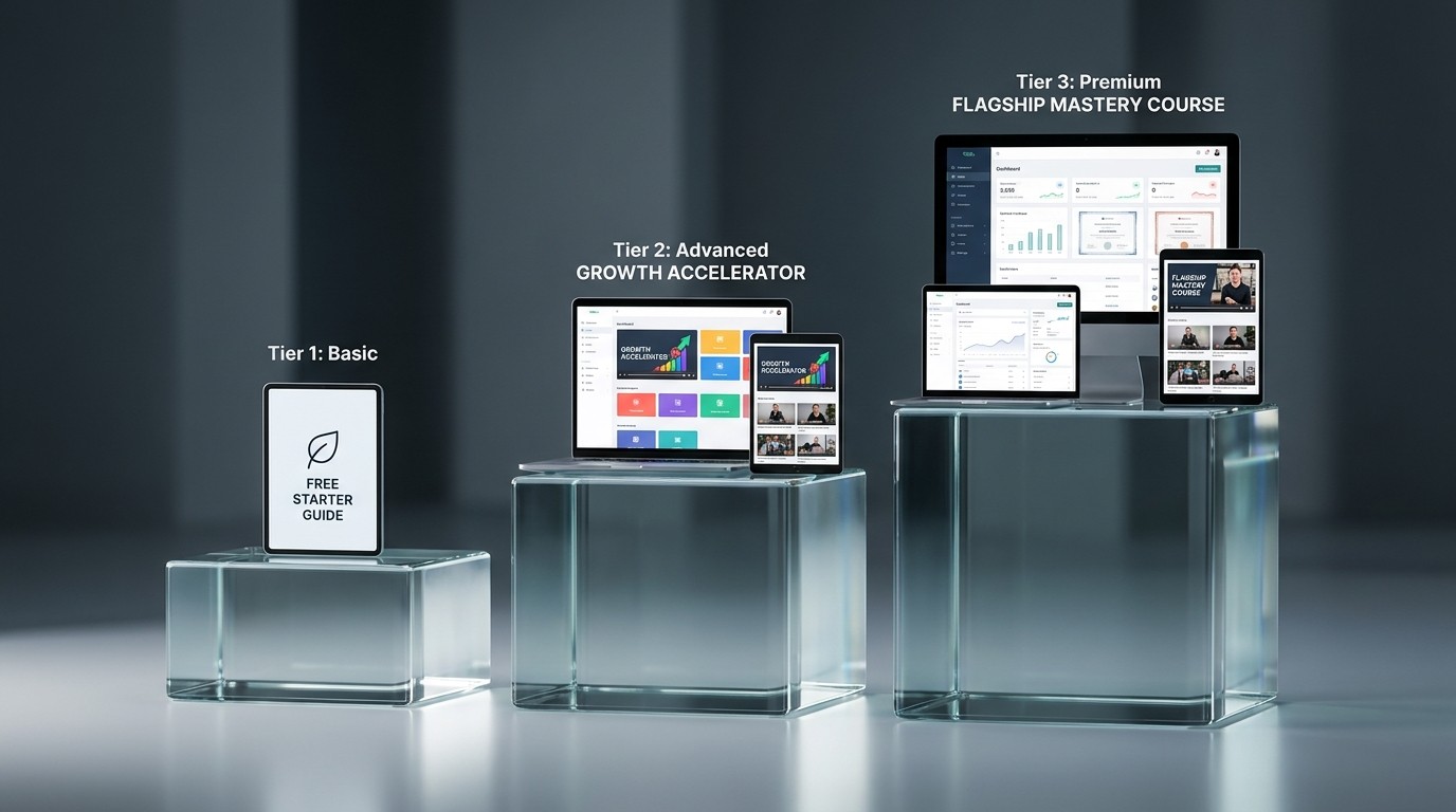
If you sell digital products, you likely have a "product ladder"—a sequence of offerings that move a customer from a free entry point to a premium, high-ticket flagship product.
A common product ladder looks like this:
The Lead Magnet (Free): A simple checklist or template.
The Tripwire ($27 - $47): A comprehensive workbook or mini-course.
The Flagship ($497+): A massive video course, software tool, or premium coaching community.
The strategic error most creators make is designing all three tiers to look exactly the same.
If your free PDF checklist looks identical to your $500 masterclass dashboard, you are visually destroying the perceived value of your premium offering. Conversely, if they look entirely different, you break brand consistency and lose trust.
You must use visual design cues to clearly differentiate the tiers of your offerings while keeping them undeniably tethered to the same brand family.
Designing the Tiers: A Strategic Approach
The goal is to increase the "density," interactivity, and polish of the design as the price increases.
Tier 1: The Lead Magnet (Free)
The design goal here is speed, clarity, and utility. It should look professional, but it shouldn't look overly expensive or complex to produce.
Format: Typically a PDF, a single Notion page, or a simple email sequence.
Visual Style: Clean, airy, and straightforward. Use your primary brand colors heavily.
Imagery: Minimal. Rely on typography and simple icons or brand patterns rather than heavy, custom illustrations or photography.
The Vibe: "Here is the quick, actionable solution I promised."
Tier 2: The Tripwire (Low-to-Mid Ticket)
The user has now paid you money. The design must immediately validate their purchase and alleviate buyer's remorse. The goal is structure, depth, and perceived effort.
Format: A multi-page interactive workbook, a beautifully structured Notion dashboard, or a heavily designed slide deck.
Visual Style: Introduce more depth. If the freebie was mostly white space, introduce your secondary brand colors as backgrounds.
Imagery: Use higher-quality mockups and more complex diagrams or charts to explain concepts.
The Vibe: "This is a substantial resource that required serious effort to create."
Tier 3: The Flagship (High Ticket)
This is your premium offering. The design must scream luxury, exclusivity, and high production value. The goal is immersion and premium experience.
Format: A custom-hosted course platform (Kajabi, Teachable, custom web app), highly produced video content, and comprehensive supplementary materials.
Visual Style: This is where you pull out all the stops. Use dark mode options for a sleeker feel. Introduce subtle animations, premium custom typography (perhaps a specific font weight reserved only for the flagship), and sophisticated layout structures.
Imagery: Custom art direction, professional photography, bespoke 3D illustrations, or highly polished motion graphics in the videos.
The Vibe: "You have entered an elite, transformative environment."
Maintaining Brand Consistency Across Tiers
How do you make the Flagship look vastly superior to the Freebie while ensuring they still look like they come from the same company?
The Unifying Font: Keep your core body copy font the same across all products. You can change the heading styles (e.g., using a heavier, more stylized version of your brand font for the flagship), but the core reading experience should remain consistent.
The "Plus One" Rule for Color: Your Freebie might use your primary brand color (e.g., Blue) and a neutral (White). The Flagship uses the exact same Blue, but introduces a rich secondary color (e.g., Navy or Gold) and premium textures (like a subtle grain or gradient) that aren't present in the lower tiers.
Consistent Naming Conventions: Use consistent terminology and iconography. If a "Module" is represented by a specific square icon in the free PDF, use a 3D, animated version of that exact same square icon in the premium video course.
By carefully escalating the visual density and production value of your products, you visually justify your pricing strategy and create a compelling psychological drive for your customers to ascend the ladder.