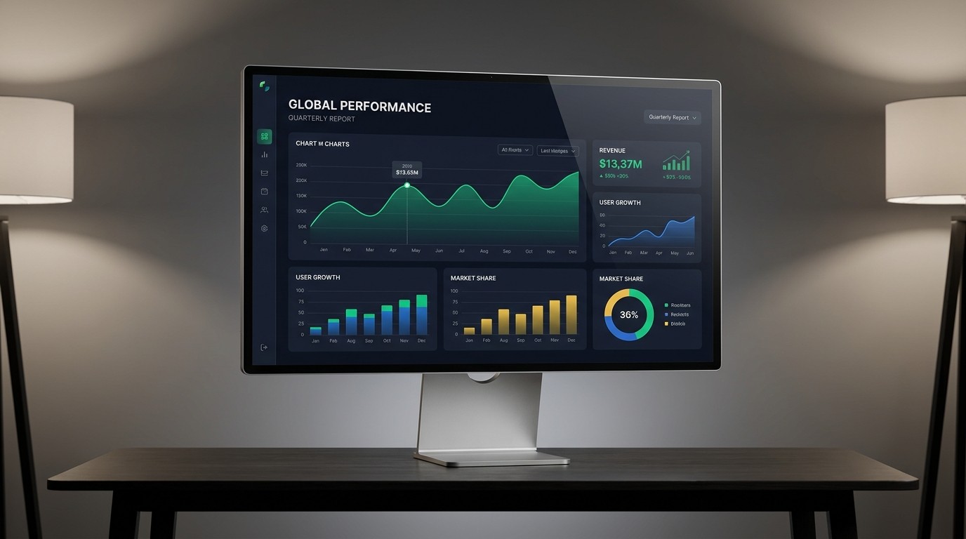
We live in a world drowning in data. Every click, sale, and user behavior is tracked and compiled into massive, imposing spreadsheets.
For many businesses, the default method of presenting this data is an unstyled Excel table or a generic, automatically generated pie chart from Google Analytics.
This is a massive missed opportunity. Raw data is inherently boring and difficult for the human brain to process quickly. As a designer, your job is to bridge the gap between complex numbers and human understanding. This discipline is known as Data Visualization, and when executed correctly, it turns dry analytics into compelling, persuasive visual stories.
The Core Objective: Clarity Before Beauty
The most common trap designers fall into when working with data is prioritizing aesthetics over accuracy.
A chart can be visually breathtaking—featuring stunning 3D elements and complex radial gradients—but if the user cannot immediately understand the key takeaway within three seconds, it is a failure of design.
Data visualization must follow a strict hierarchy:
Truth: Does it represent the data accurately without distortion?
Clarity: Is the main insight immediately obvious?
Beauty: Is it aesthetically pleasing and aligned with the brand?
Choosing the Right Visual Vehicle
You cannot just pick a chart type because it looks cool. The format must match the story the data is trying to tell.
To Show Change Over Time: Use Line Charts or Area Charts. Avoid bar charts for long timelines, as they become cluttered.
To Compare Categories: Use Horizontal or Vertical Bar Charts. (Pro-tip: Sort the bars by size, not alphabetically, to make comparisons instant).
To Show Parts of a Whole: Use Donut Charts or Treemaps. Stop using Pie Charts with more than three slices; the human eye is terrible at comparing the area of angled slices.
To Show Relationships or Distribution: Use Scatter Plots or Bubble Charts.
Design Rules for Beautiful Data
Once you’ve selected the right format, apply these design principles to elevate the presentation from a boring spreadsheet export to a premium infographic.
1. Ruthlessly Minimize "Chart Junk"
Edward Tufte, a pioneer in data visualization, coined the term "data-ink ratio." The goal is to remove any ink (or pixels) that do not directly present data.
Remove gridlines: If you must keep them, make them incredibly faint (e.g., 10% opacity gray).
Delete borders: You don't need a heavy black box around your chart.
Clean up the axes: Remove unnecessary decimal points (use
$10kinstead of$10,000.00).
2. Use Color Strategically, Not Decoratively
Do not use six different bright colors for a bar chart if all the bars represent the same category of metric.
The Highlight Approach: Make all the bars in your chart a muted brand color (like a soft gray-blue). Then, take the one bar that represents the key insight you want the audience to see (e.g., "Our Q3 Growth") and make it a vibrant, high-contrast action color (like bright orange).
Semantic Color: Ensure colors make logical sense. If showing profit/loss, use green for positive and red for negative. Don't force brand colors if they contradict universal meanings.
3. Write "Insightful" Titles
The title of your chart shouldn't just describe the data; it should tell the reader what the data means.
Bad Title: Sales Revenue 2022 vs 2023
Good Title: Q4 Marketing Push Drove a 40% Increase in Year-Over-Year Revenue
The reader shouldn't have to study the chart to figure out the point; the title should tell them the point, and the chart should visually prove it.
4. Animate for Comprehension (Not Just Flash)
In digital reports or presentations, animation can vastly improve comprehension.
Don't just have a complex line chart fade in all at once. Animate the line drawing itself from left to right across the timeline. This guides the viewer's eye chronologically, allowing them to experience the "journey" of the data rather than being overwhelmed by the final result all at once.
Data is the most powerful tool a business has, but raw data is unpersuasive. By applying rigorous design principles to your analytics, you transform cold numbers into an undeniable narrative.