Stop Using Generic Mockups: How to Present Your Digital Products Like a Pro
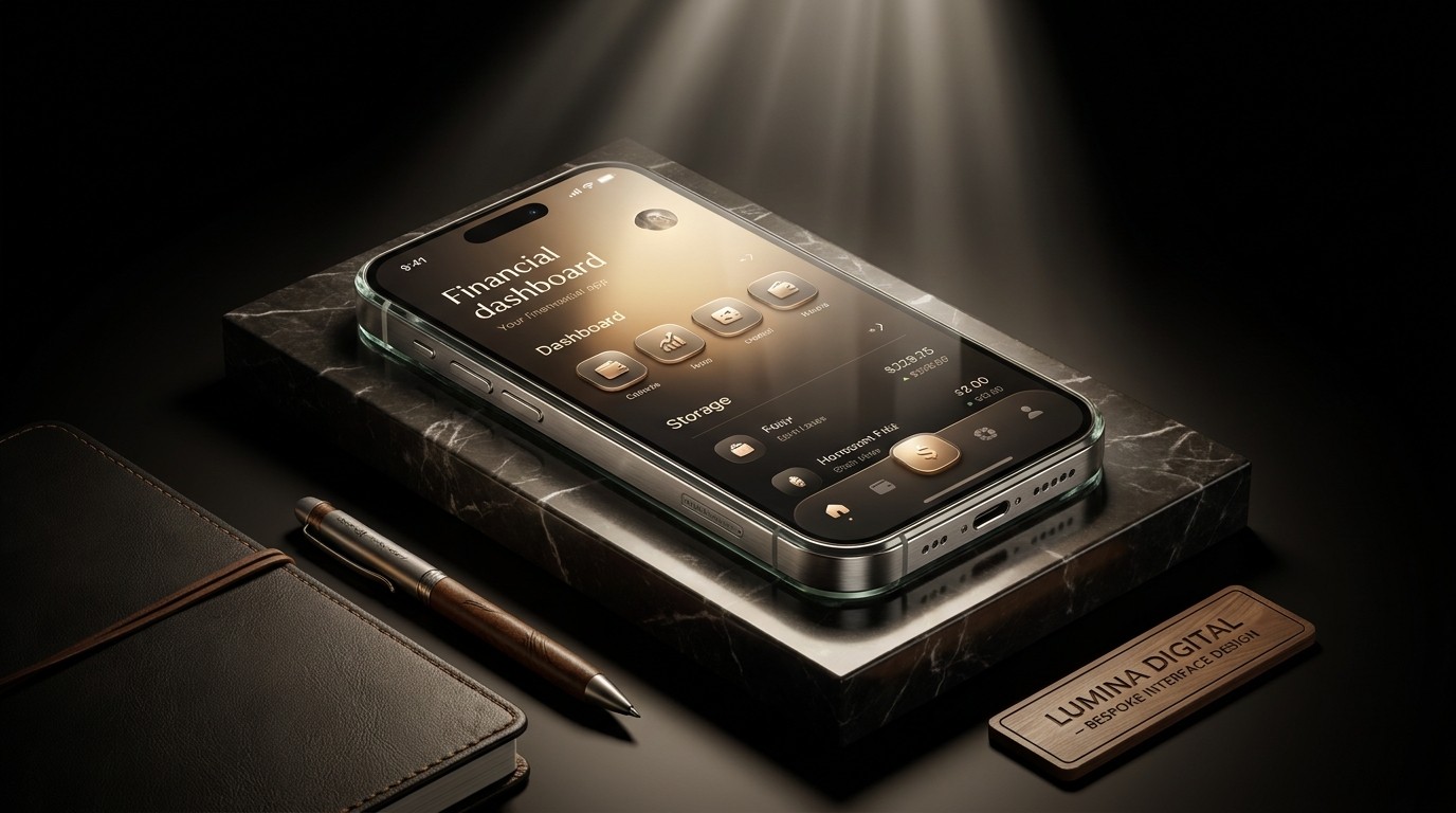
You’ve spent weeks, maybe months, meticulously designing an app interface, a digital workbook, or a comprehensive branding package. The work is flawless.
But when it comes time to present it to a client or sell it on your website, you slap it onto a free, generic isometric MacBook mockup you downloaded from a stock site.
Suddenly, your premium, bespoke design looks exactly like every other $15 template on the internet.
In digital design, presentation is 50% of the perceived value. If you want to charge premium prices, you must present your work in a premium context. It’s time to stop using overused stock mockups and start presenting your digital products like a top-tier agency.
The Problem with Stock Mockups
Generic mockups—like the floating isometric iPhone, the floating floating iPad next to a monstera leaf, or the completely flat screen grabs—suffer from several critical flaws:
Lack of Context: They place your design in a sterile vacuum. They don't tell a story about who uses the product or how it feels to interact with it.
Visual Cliché: Clients and customers are visually literate. They recognize the same three mockup templates because they've seen them hundreds of times. It subconsciously signals a lack of effort.
Distraction: Often, the mockup itself (e.g., a highly detailed, brightly colored 3D room) competes with the actual design work you are trying to showcase.
Strategies for Pro-Level Presentations
To elevate your presentations, you need to shift from "displaying screens" to "curating an environment." Here are three advanced techniques to upgrade your mockups.
1. The Hyper-Realistic Photographic Mockup
Instead of 3D renders, use high-resolution, carefully art-directed photography.
You don't need a massive budget for this. The goal is to show the digital product interacting with the physical world in a realistic, non-cheesy way.
The Close-Up: Don't show the whole phone. Show an extreme, high-res macro shot of a thumb interacting with a specific UI element on the screen. The focus is on the interface detail, with the physical hardware blurring into the background depth-of-field.
The Shadow Play: Use stark, interesting shadows (like light filtering through blinds) cast across a clean screen. This adds immense depth and a cinematic quality to an otherwise flat UI.
Sourcing: Look for premium mockup foundries that focus on realistic lighting and diverse environments, rather than standard tech-bro desk setups.
2. The Abstract/Architectural Environment
If you want to avoid literal photography, move toward highly abstract, architectural 3D environments.
Instead of putting your UI on a laptop, float the screens within a beautifully lit, minimalist 3D space.
Materials: Use premium textures in the background—concrete, brushed steel, frosted glass, or soft matte plastics.
Lighting: The key here is studio-quality lighting. Soft, diffused lights that cast realistic ambient occlusion shadows behind your floating screens.
Why it works: It removes the specific context of a specific device, framing your digital work as a piece of high-end art in a gallery setting.
3. The "UI Ecosystem" Layout
Stop showing screens in isolation. A modern digital product is an ecosystem.
Present your work as an interconnected web of screens.
The Grid: Lay out 10-15 screens from the app in a massive, perfectly aligned grid. This instantly communicates the depth, scale, and consistency of the design system.
The Flow: Show three screens side-by-side with subtle arrows or lines connecting a user journey (e.g., from the dashboard, to a detail view, to a checkout modal).
Layering: Slightly overlap mobile screens on top of desktop screens to show the fluid, cross-platform nature of the product.
Execution Rules
Regardless of the style you choose, follow these golden rules of presentation:
Crop Aggressively: The hardware is not the star; your design is. Crop into the mockups so the UI takes up 80% of the frame.
Maintain Resolution: Nothing ruins a presentation faster than a pixelated UI. Ensure your screens are exported at 2x or 3x resolution before placing them in the mockup.
Tell a Story: Sequence your presentation logically. Start with an arresting hero image, move into the core features, show the design system grid, and end with an interactive detail.
By investing time in custom, hyper-realistic, or highly stylized presentations, you instantly elevate the perceived value of your digital products, allowing your hard work to truly shine.