Brand Identity
Minimalism is Dead. Long Live Maximalism: Navigating the Shift in Brand Expression
Maya Patel
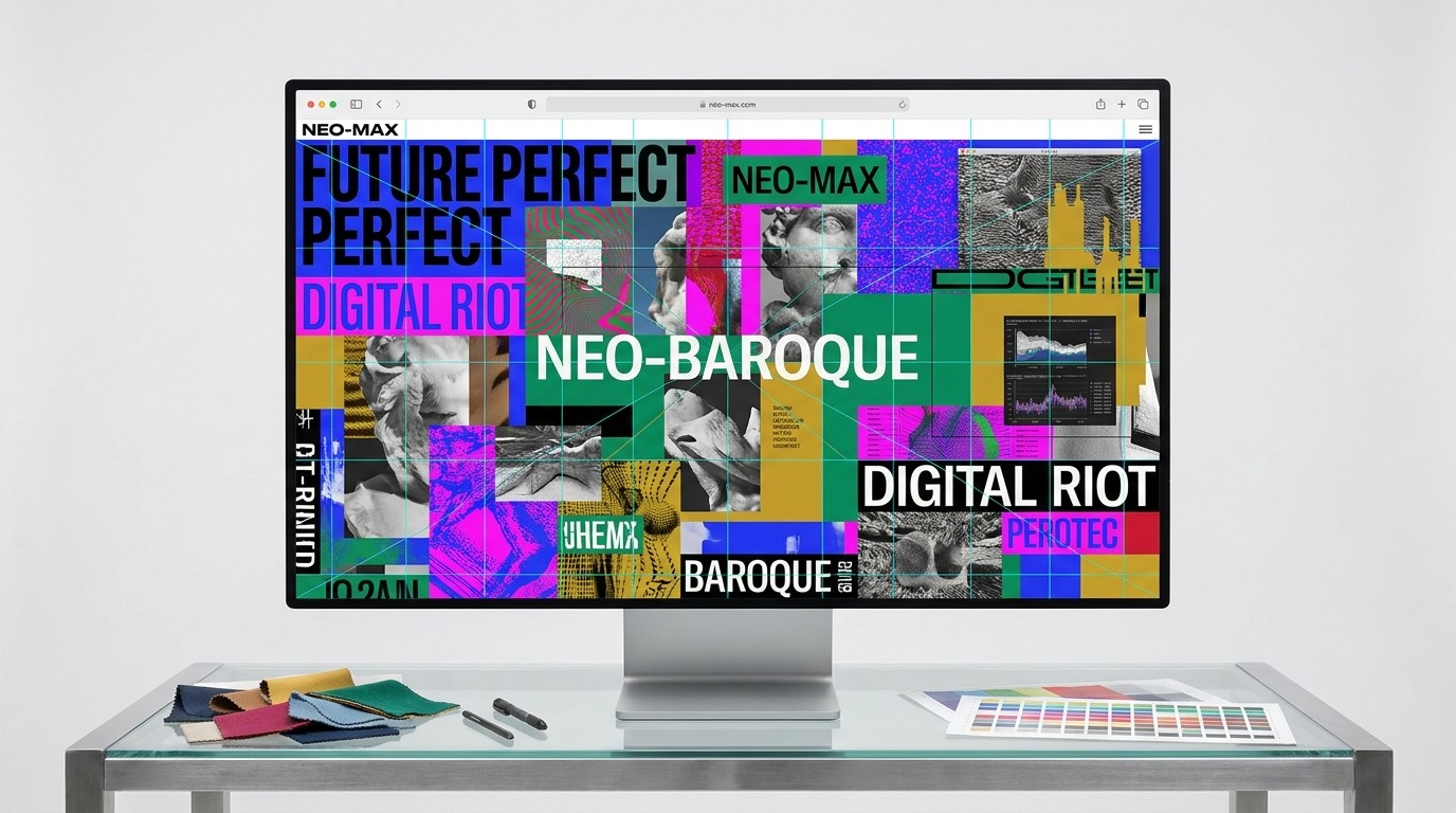
For the better part of a decade, digital design has been held hostage by a rigid interpretation of minimalism.
"Less is more." "White space is king." "Remove everything until it breaks."
This dogma resulted in a highly functional but incredibly sterile digital landscape. Every SaaS landing page, every direct-to-consumer brand, and every lifestyle app began to look exactly the same—a sea of sans-serif fonts, vast expanses of white space, and generic, desaturated photography.
But the pendulum is swinging violently in the opposite direction. Audiences are bored. They are craving personality, emotion, and visual stimulation. Enter the era of digital maximalism.
Minimalism isn't entirely dead, of course—it will always have a place in functional UI—but as a brand expression strategy, it is rapidly losing its power to differentiate. It's time to understand how to navigate the shift toward bold, chaotic, and expressive design.
What is Digital Maximalism?
Maximalism is the aesthetic of excess. It is loud, unapologetic, and highly layered. It rejects the idea that a design must be "clean" to be effective.
In the digital space, maximalism manifests as:
Saturated, Clashing Colors: Moving away from safe pastels and monochromatic palettes toward aggressive neon and high-contrast combinations.
Complex Typography: Mixing multiple typefaces, utilizing oversized, expressive display fonts, and treating text as a dominant graphic element rather than just a vessel for reading.
Layering and Density: Overlapping images, textures, patterns, and text to create depth and visual intrigue.
Motion and Interaction: Heavy use of kinetic typography, scroll-triggered animations, and micro-interactions that make the interface feel alive.
Why the Shift? The Need for Authenticity
The rise of maximalism is a direct response to the homogenization of the web. When every brand looks like an Apple clone, looking like Apple is no longer a competitive advantage.
Maximalism allows brands to reclaim their unique voice. It signals authenticity. A slightly chaotic, highly textured design feels human, whereas a perfectly sterile, minimalist design feels algorithmic and corporate. In an era where consumers are increasingly skeptical of polished corporate facades, the raw energy of maximalism builds genuine connection.
How to Do Maximalism Without Creating a Mess
The biggest misconception about maximalism is that it requires abandoning all design principles. This is false. Good maximalism is highly orchestrated chaos. It requires more skill than minimalism because you are balancing far more variables.
If you just throw every color and font onto a page, you won't get maximalism; you'll get a usability nightmare.
Here is how to embrace complex visuals while maintaining user readability:
1. Establish a Ruthless Underlying Grid
You can break the rules on the surface only if the foundation is rock solid. No matter how wild the typography or how layered the imagery, the underlying structure of the page must be based on a strict grid system. This ensures that the layout remains grounded and scannable, even amidst visual noise.
2. Prioritize the Visual Hierarchy
In minimalism, hierarchy is achieved through white space. In maximalism, hierarchy is achieved through scale, color contrast, and motion. You must be aggressively decisive about what you want the user to see first, second, and third. If everything is huge and brightly colored, nothing stands out. Use scale dramatically—make your H1 massive, and contrast it with highly legible, appropriately sized body copy.
3. Maintain Typographic Restraint in the Details
Go wild with your display fonts for headers and hero sections. Stretch them, animate them, layer them. But when it comes to paragraphs of text, navigation menus, and call-to-action buttons, revert to highly legible, functional typefaces.
4. Use Motion with Purpose
Animation is a key component of maximalism, but it shouldn't cause motion sickness. Use kinetic typography and scroll effects to draw attention to key messages or to guide the user's eye down the page, not just for the sake of adding movement.
Embrace the Noise
The shift toward maximalism is an invitation to be bold. It is a permission slip to inject personality, culture, and point-of-view back into digital spaces. Stop trying to make your brand look perfectly clean, and start making it look perfectly yours.